Social Media Histories
A public archive of historical social media interfaces that enables researchers and designers to explore how platforms and features have evolved over time. The site organizes a fragmented collection of interface snapshots into a structured, navigable system.
Employer
U-M School of Information - Living Online Lab
Role
Lead UX Designer (Internship)
Timeline
May 2024 —— August 2024
Platform
Web
Overview
/ 1
The Project
Social Media Histories is a public archive of historical social media interfaces, designed to make platform evolution searchable and comparable.
Existing archives are typically fragmented, difficult to explore, and not dedicated to social media platforms. As a result, researchers and designers lack effective tools to study feature trends or understand platform changes.
This project was part of a University of Michigan research initiative led by Professor Sarita Schoenebeck, with an 11-person interdisciplinary team working across design, development, and data collection. Other team members were responsible for collecting, archiving, and labeling interface snapshots across platforms and time periods. I then structured these materials into a system that made the data searchable, comparable, and easy to explore.
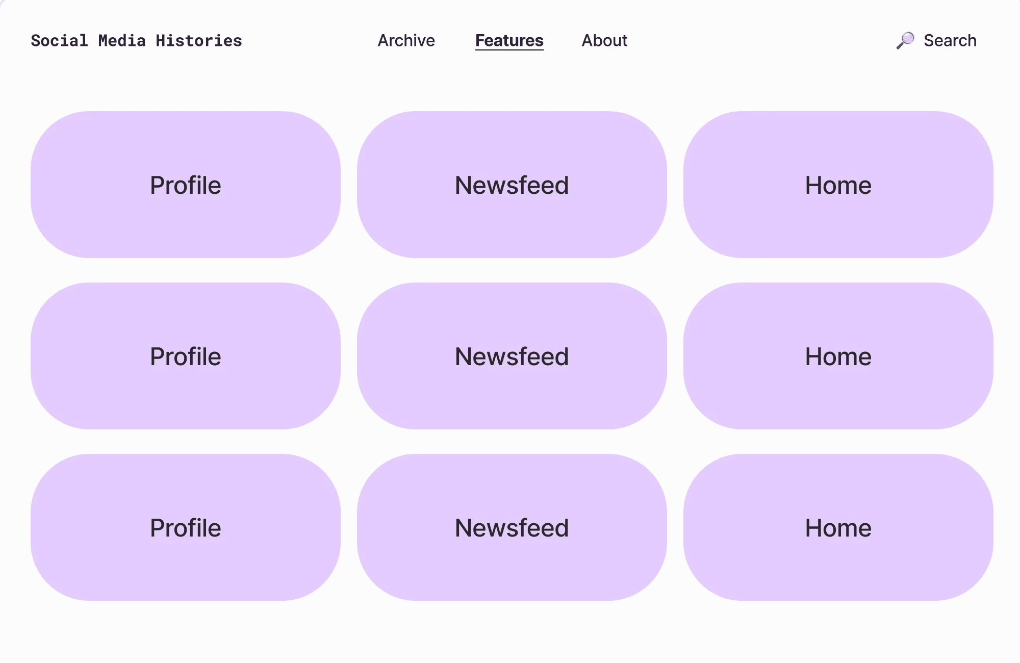
Design Objectives
Enable filtering by platform, feature, and time window
Support different image formats and metadata types
Highlight key platform design and feature changes over time
Create a simple, accessible experience for a wide audience
My Role
I served as the primary designer for the website, contributing across the full design process.
Conducted research and helped define the project's scope
Designed the interface and interaction patterns in Figma
Created a custom design system and project logo
Collaborated closely with developers to ensure implementation was feasible
Research
/ 2
Target Users
Academic Researchers
Educators / Students
UX Professionals
Journalists
Policymakers
Hobbyists
Based on these groups, I developed personas to capture key needs, behaviors, and use cases, helping guide design decisions and prioritize features across a diverse audience.
Key Needs Across Groups
Access to precise, well-documented historical data
Ability to compare changes across time and platforms
High-quality visuals for detailed study
Downloading and citation support
Clear sourcing and metadata
Comparative Analysis
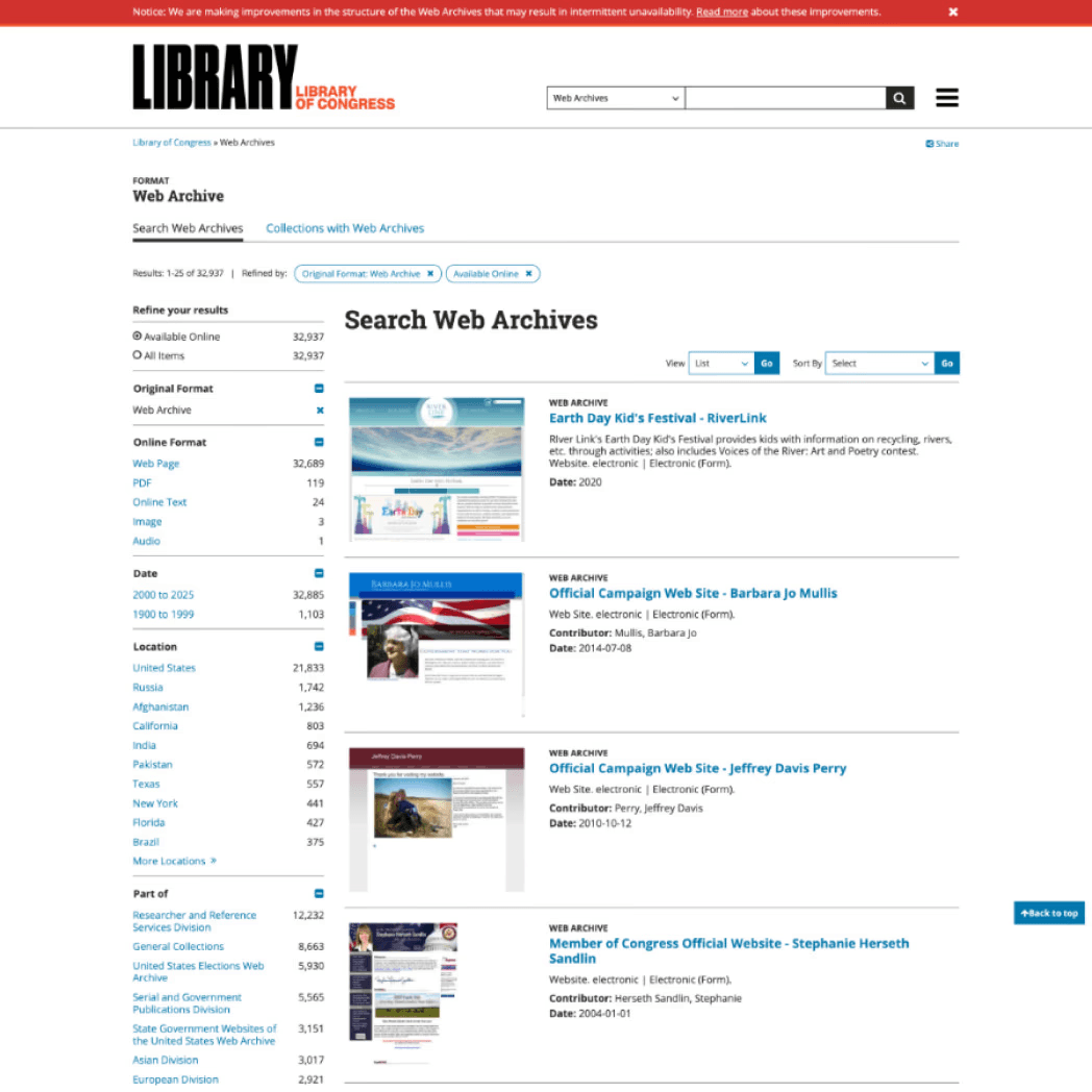
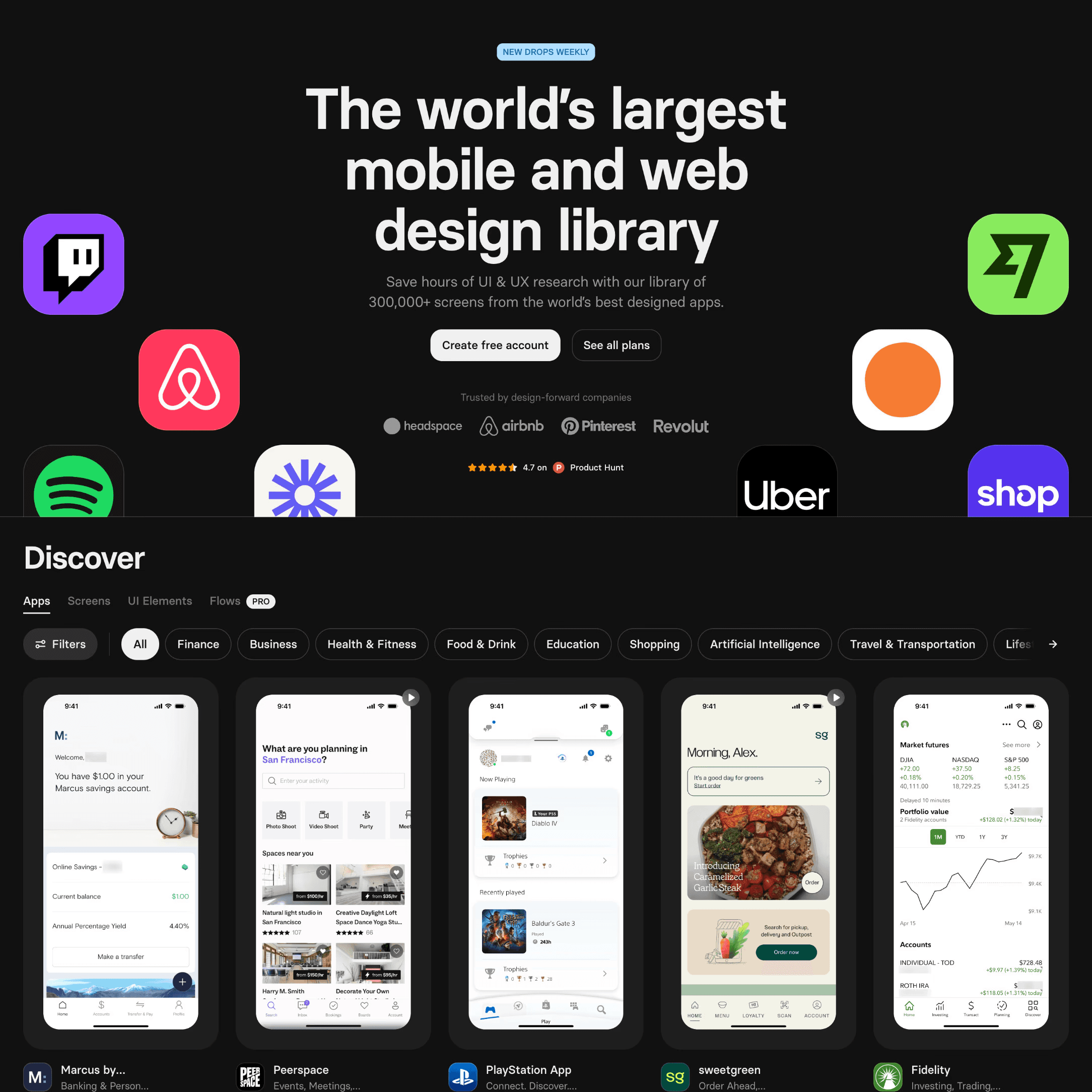
To inform the design, I analyzed:
Libraries
Archives
Digital Timelines
Shopping Platforms
Video Platforms
Photo Hosting Sites
Comparative feature and interaction research
Key Insights
Consumer shopping sites offer intuitive filtering systems
Horizontal, persistent filter controls are faster and easier to use than alternatives
Large pop-up views can reduce navigation friction when used intentionally
Too many filter categories reduce clarity for new users
Masonry layouts are harder to scan than structured grids
A minimal interface helps users focus on dense visual content
Final Design
/ 3
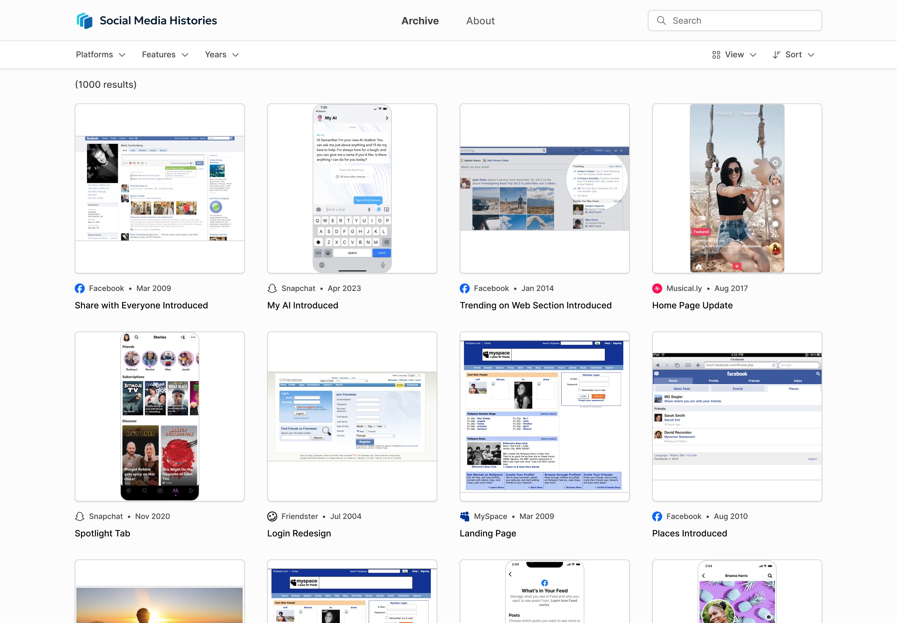
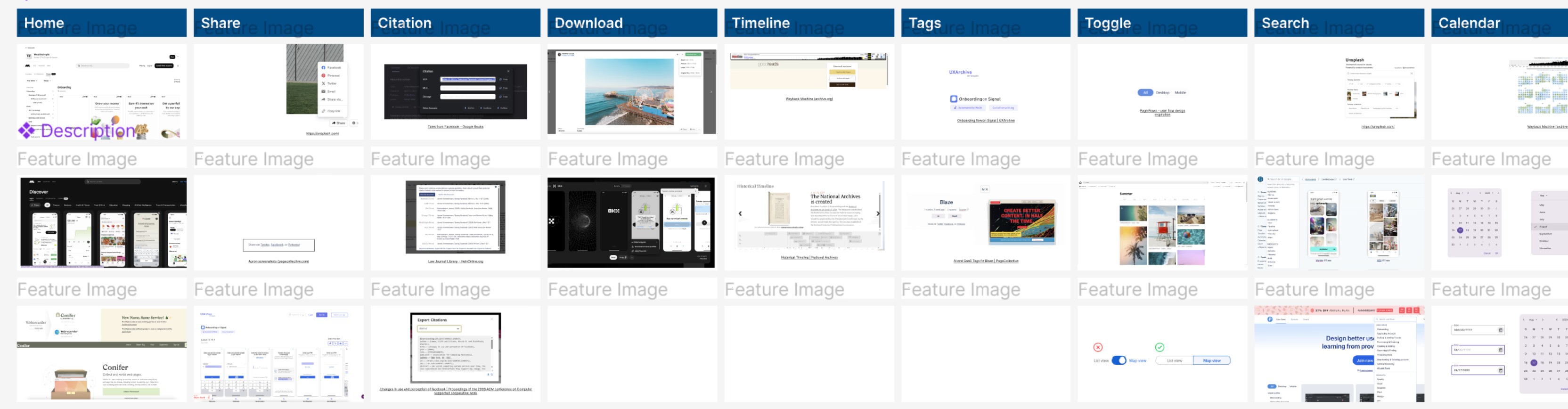
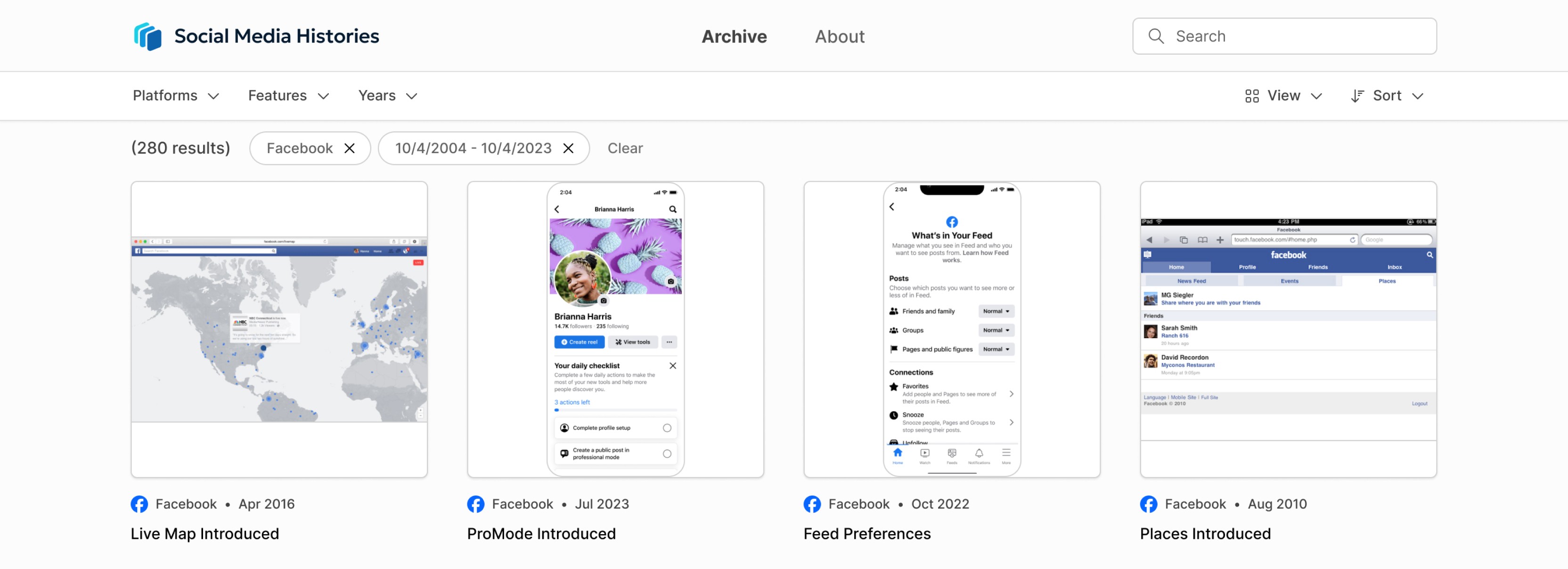
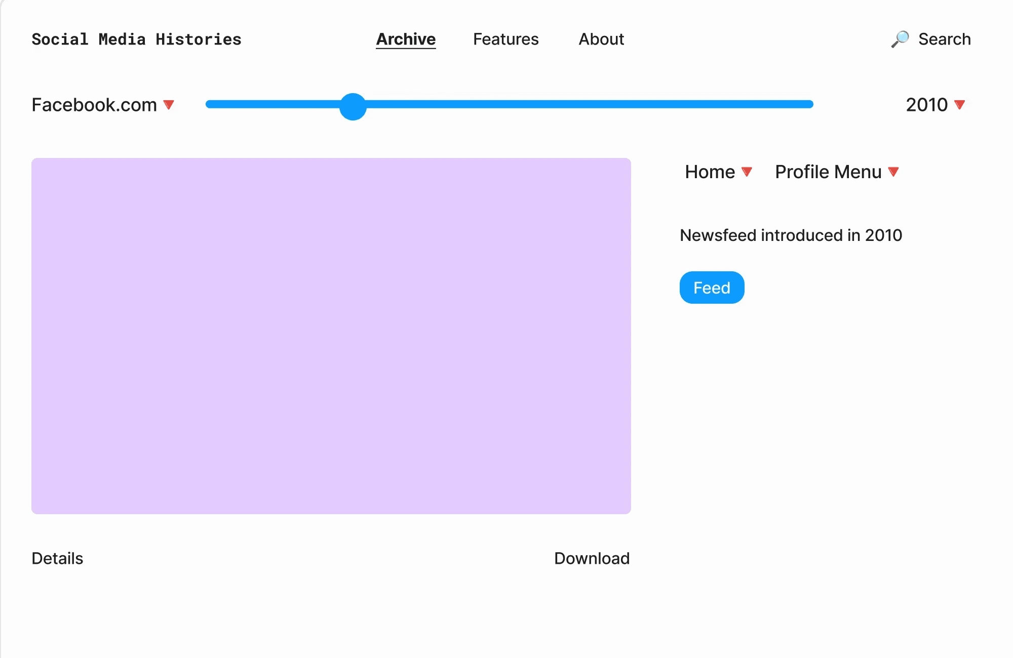
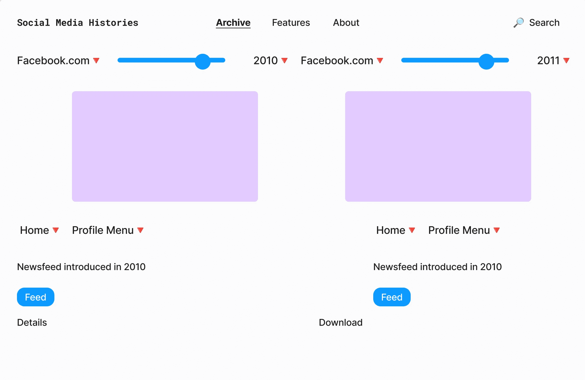
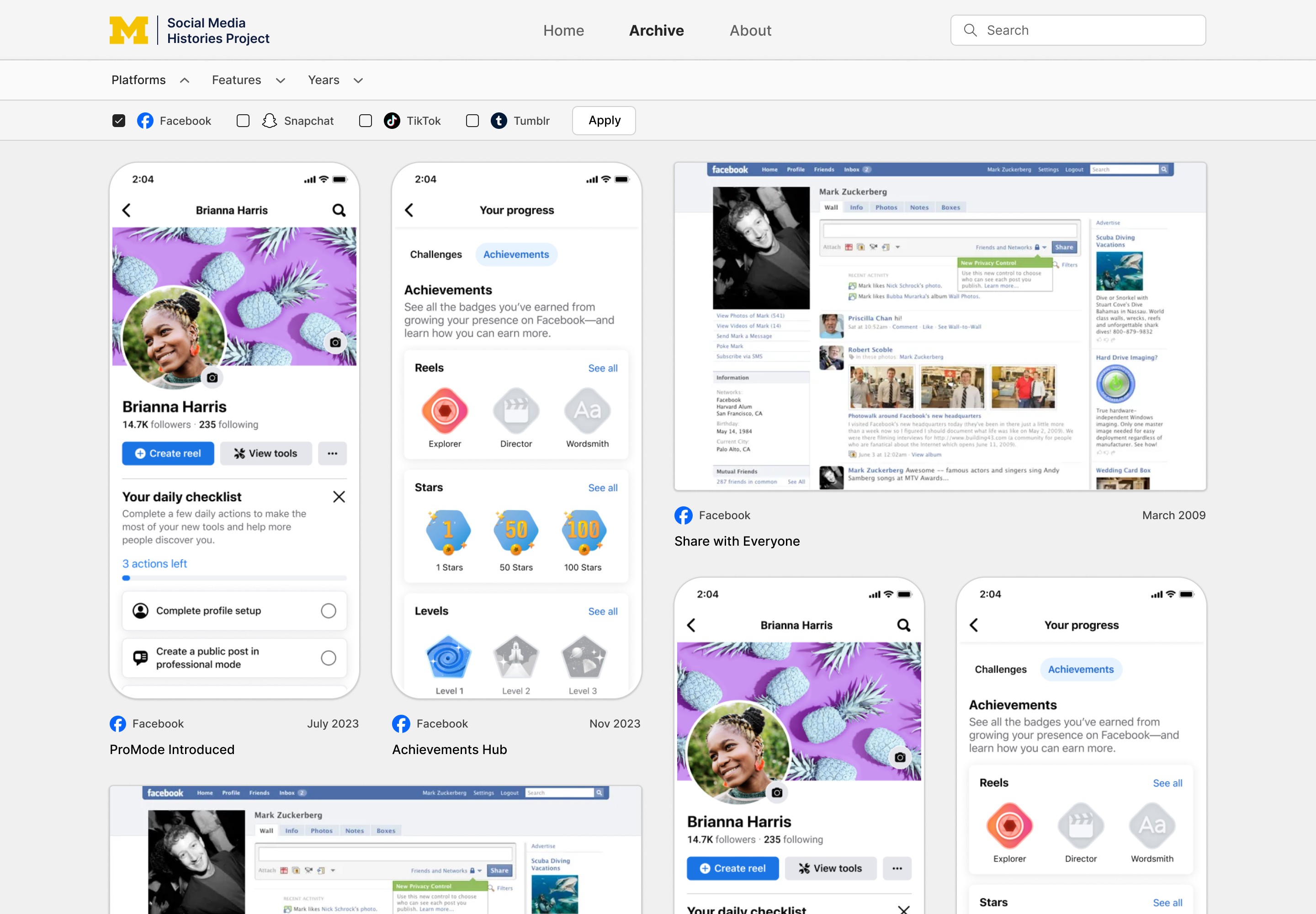
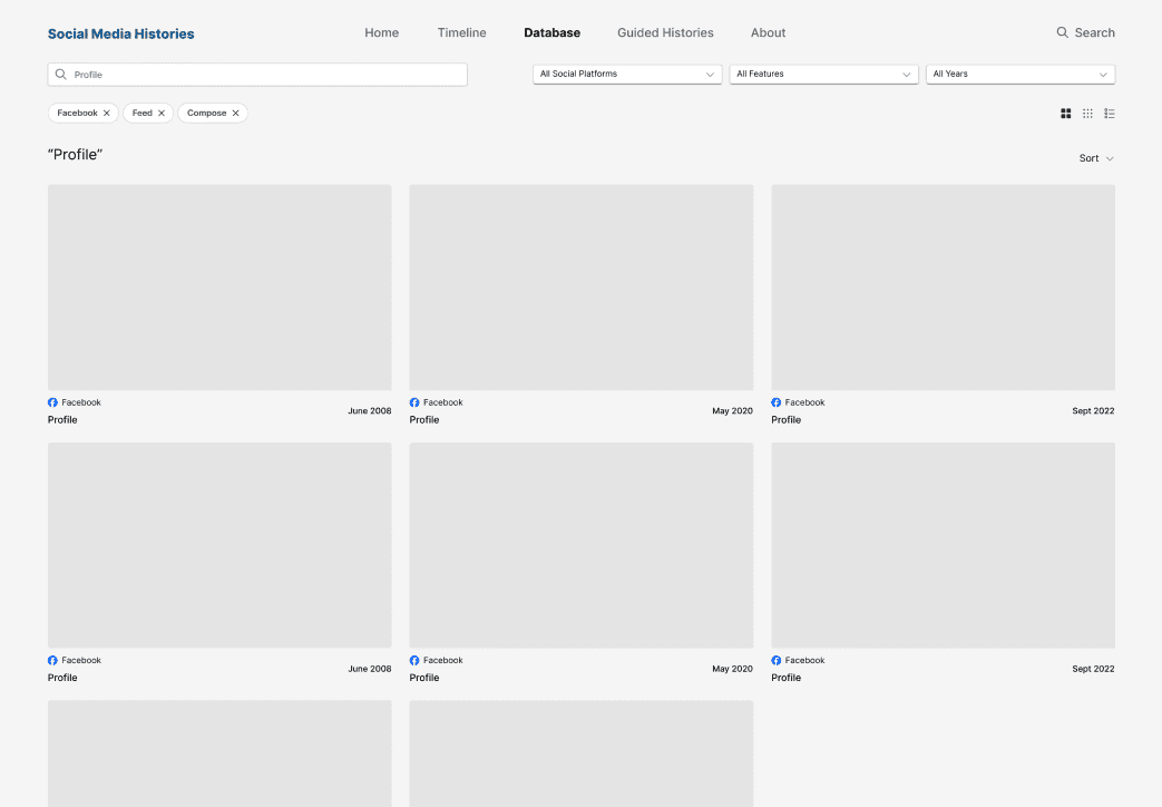
Archive Page
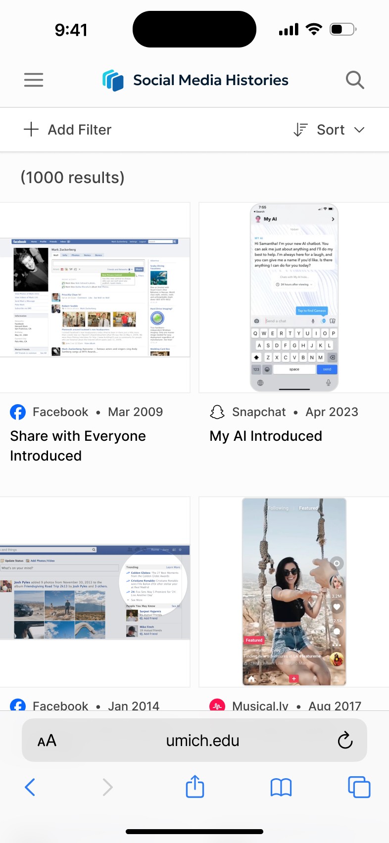
The site opens directly into the archive, allowing users to immediately begin exploring.
Key decisions:
Large logo establishes context and purpose
Cards use white backing to stand out against a light gray background
Grid layout ensures consistent scanning across varied image types
Card sizing balances information density with readability
Grid System
Each snapshot is displayed in a standardized square card:
Supports both desktop and mobile-oriented images
Maintains visual consistency across formats
Aligns metadata (platform, title, etc.) for quick scanning
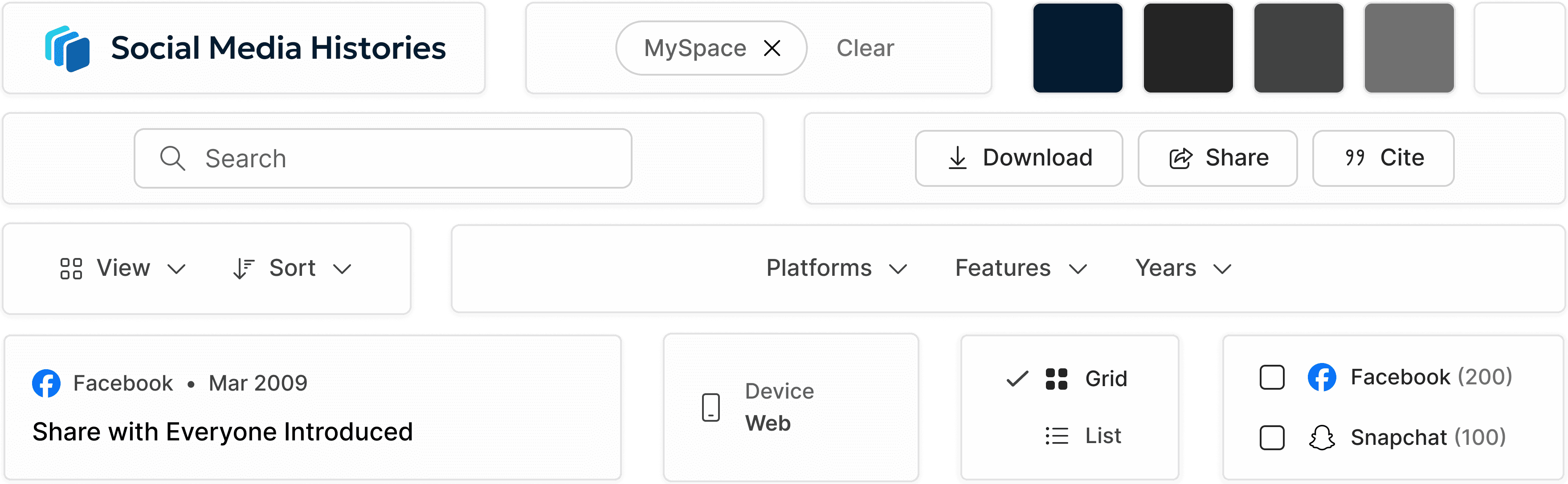
Filtering System
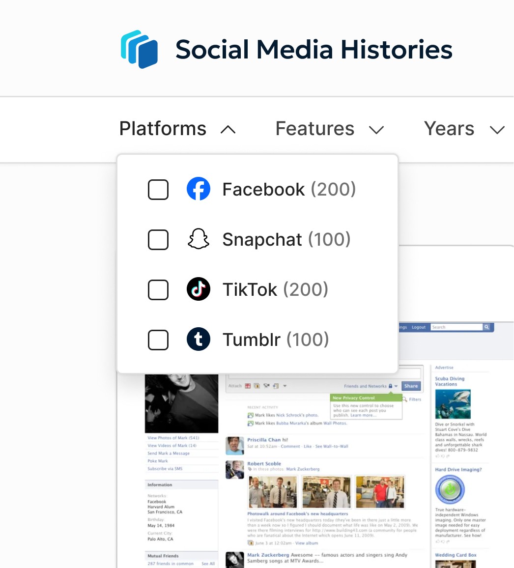
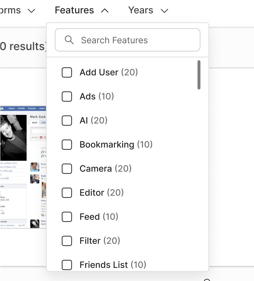
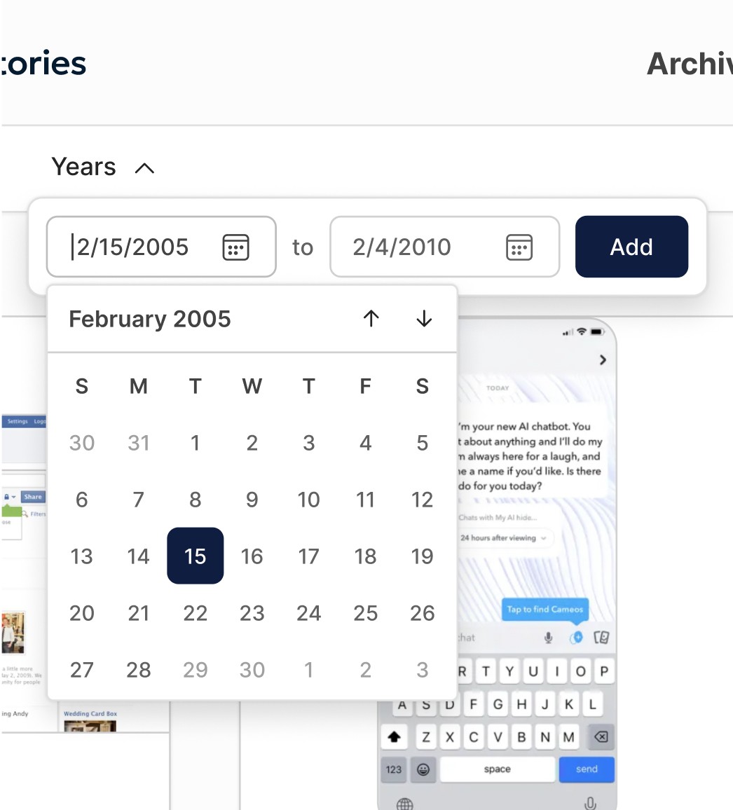
Users can filter by platform, feature, or time window.
Design decisions:
Horizontal control bar for visibility and speed
Pop-up filters to reduce clutter
Search within filters for large datasets
Calendar + text input for flexible date selection
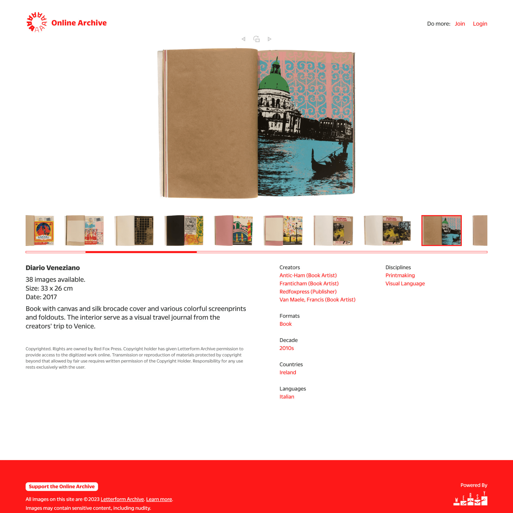
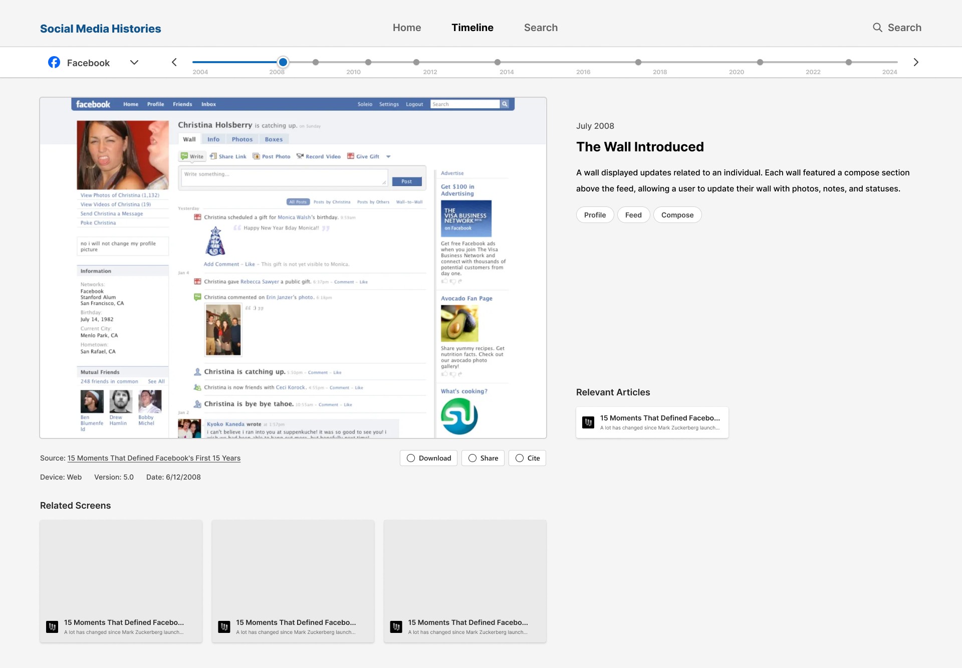
Snapshot Details
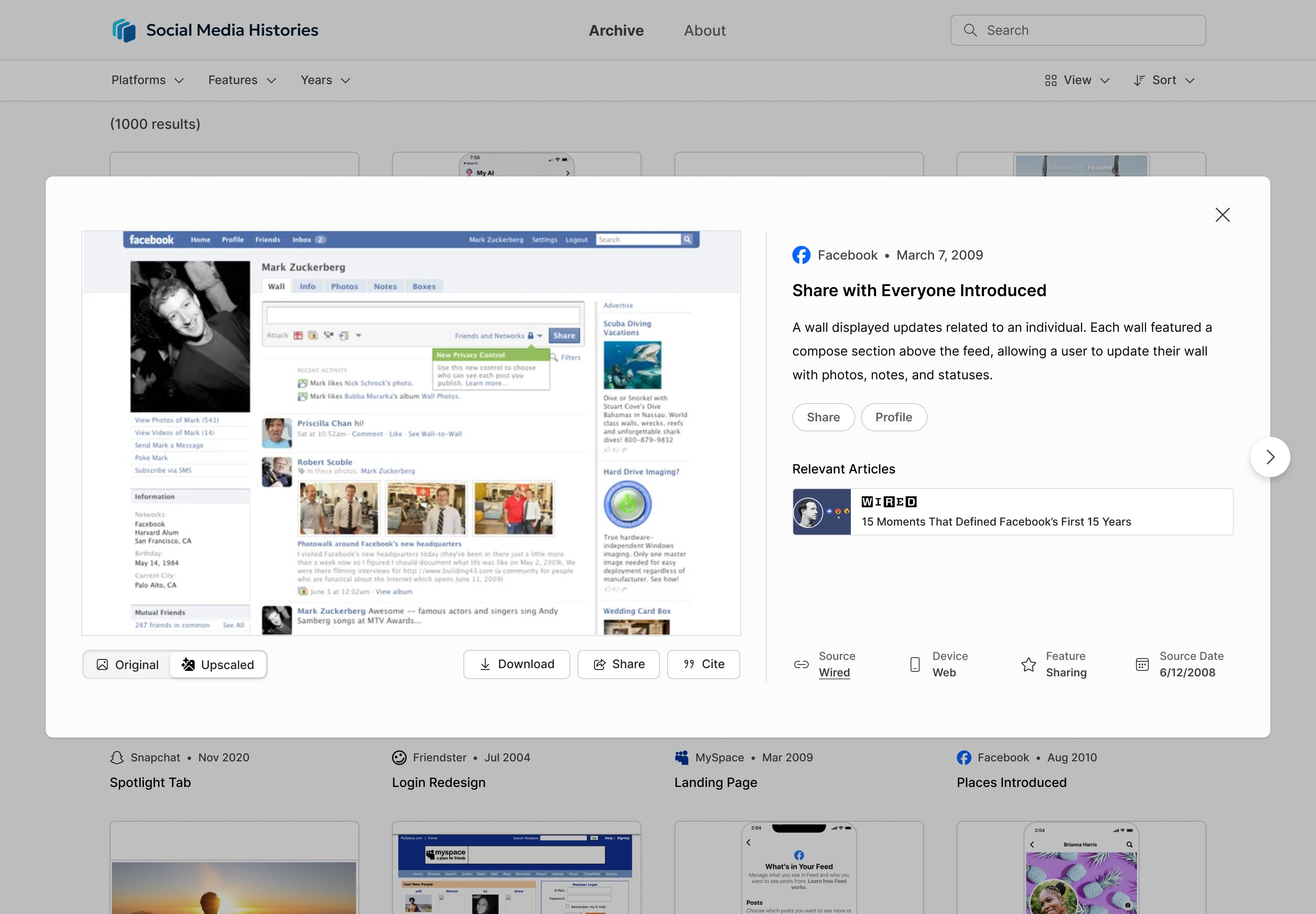
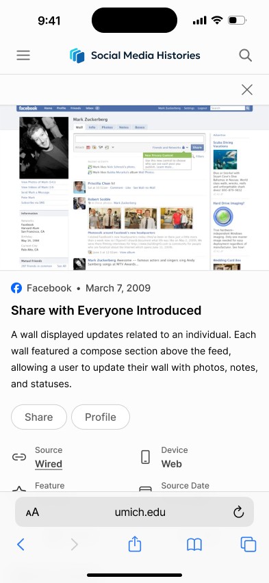
Selecting a card opens a detailed view with:
Full-size image
Structured metadata
Feature tags
Navigation between adjacent snapshots
Additional features:
Toggle between original and high-resolution recreation
Download, share, and citation functionality
Tag-based navigation to explore related content
Search
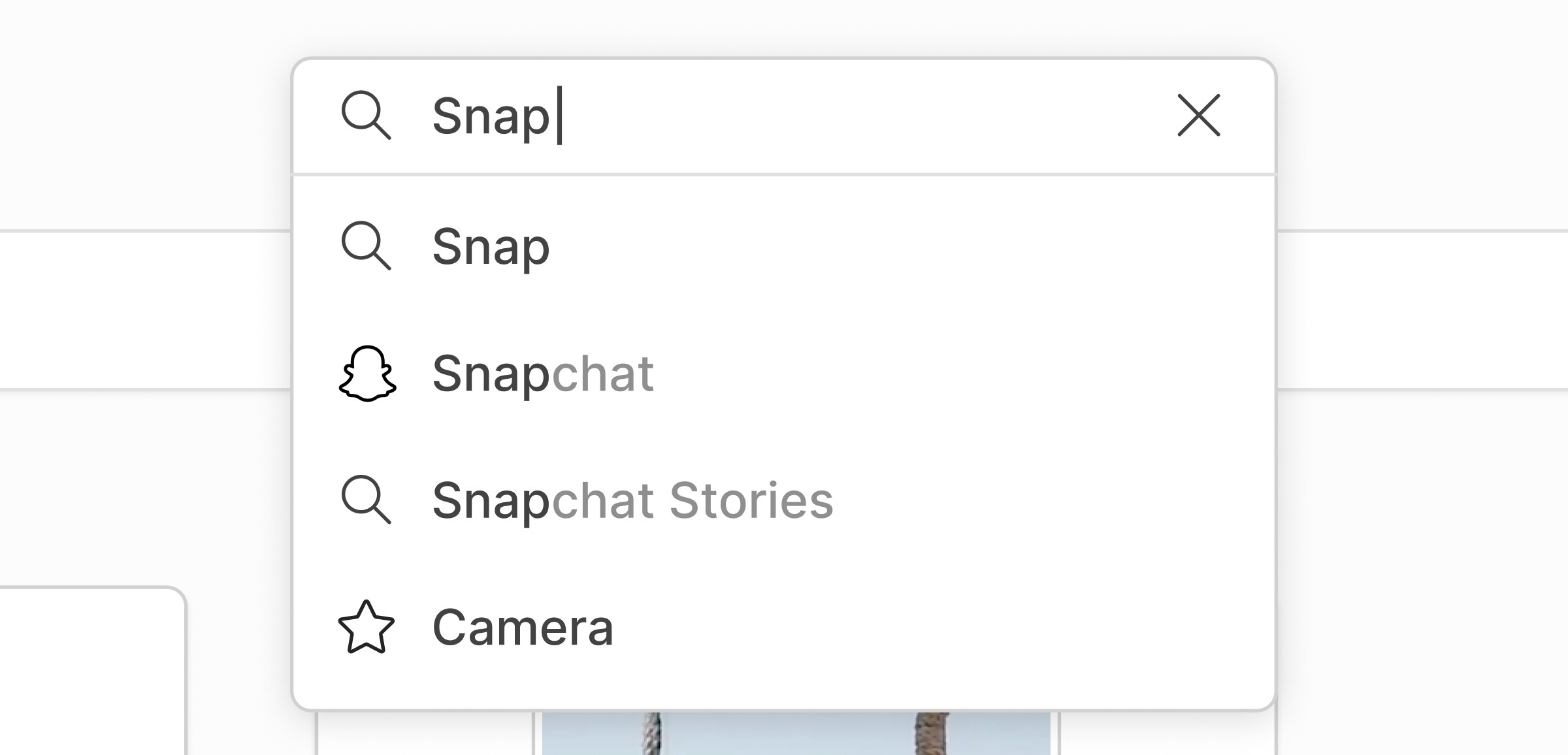
Persistent search bar in navigation
Supports keyword, feature, platform, and time queries
Auto-complete suggestions guide user input
Results can be refined with filters
Design Process
/ 4
Wireframing and Iteration
Created multiple layout variations in FigJam
Refined top concepts in Figma with higher fidelity
Iterated based on team feedback and new ideas
Collaborated with developers to align design with implementation constraints
Design System
/ 5
The visual system emphasizes neutrality and clarity:
Minimal color palette to avoid competing with content
Consistent spacing and alignment
Structured hierarchy for dense information
This allows the interface to support the content rather than dominate it.
Logo
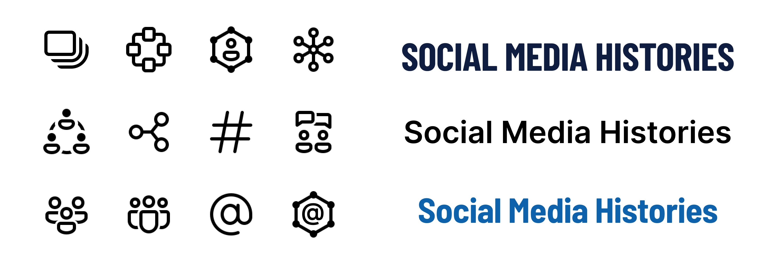

As part of my work, I was tasked with designing a logo for the platform within just a few days. I explored a range of compositions using layered rectangles with varying sizes and color treatments. The final mark was designed to represent ideas of design collections and platform evolution, while the use of color gradation helped establish a distinct visual identity for the project. Throughout the process, I focused on maintaining simplicity and legibility so the logo would remain effective at smaller sizes across interface elements.
Outcome
/ 6
The final product is a structured, searchable archive that:
Makes historical interface data accessible
Enables comparison across platforms and time
Supports research, teaching, and exploration
The system balances flexibility (search, filters) with clarity (grid structure, minimal UI).
Reflection
This project reinforced the importance of designing for information-heavy environments.
Key takeaways:
Structure and hierarchy matter more than visual complexity
Small layout decisions significantly impact scanability
Designing for multiple audiences requires prioritizing shared needs